


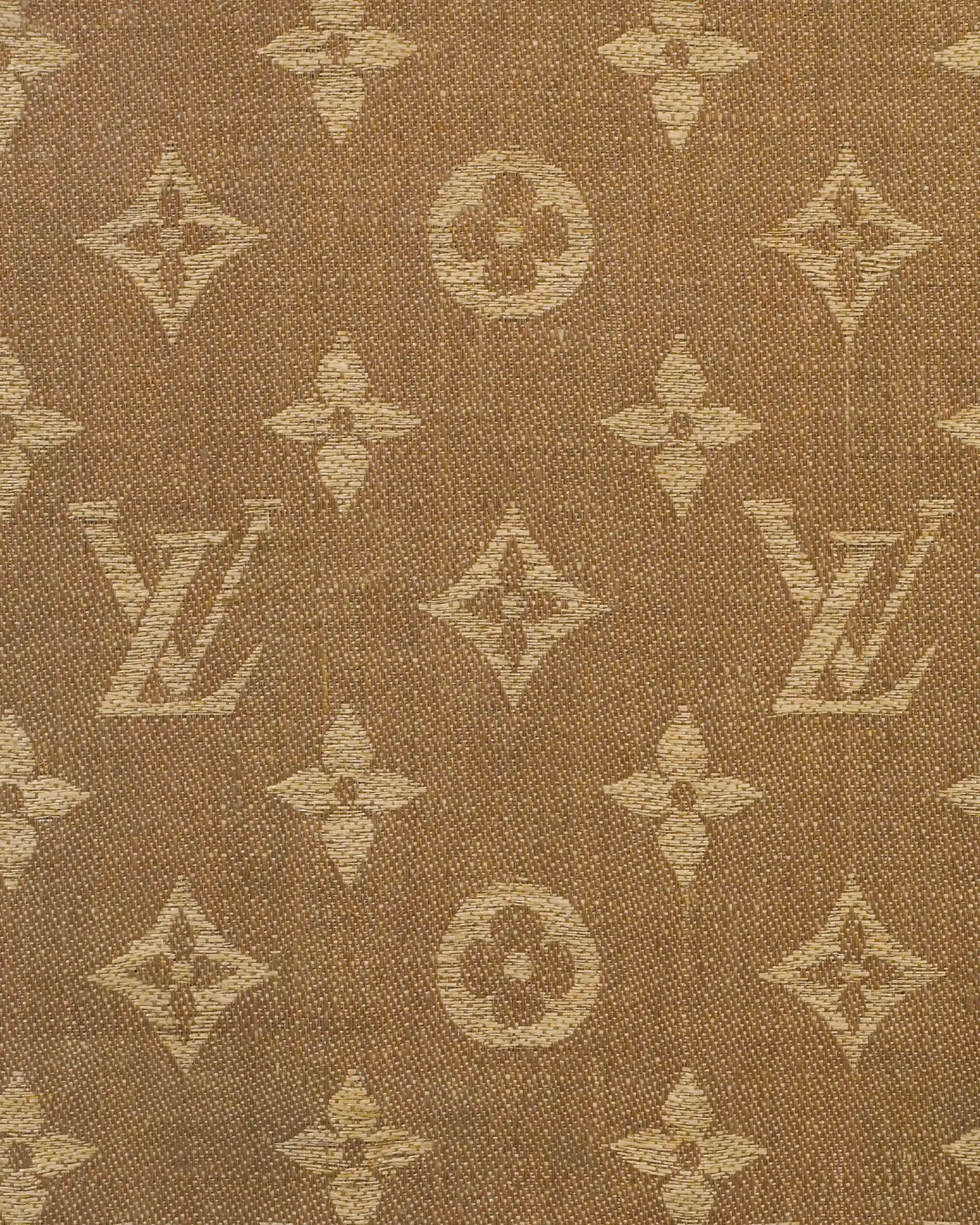
A real signature doesn’t explain itself. It shows up, gets clocked, and keeps moving. For 130 years, Louis Vuitton’s Monogram has done exactly that. Conceived in 1896 by Georges Vuitton as a way to protect his father’s work from imitation, it began as a practical gesture—authorship made visible. But practicality rarely stays small in Paris. What followed was something far bigger: a visual language that learned how to travel, adapt, and remain instantly recognizable without ever standing still.
RELATED: What They Don’t Tell You About Becoming A Career Woman
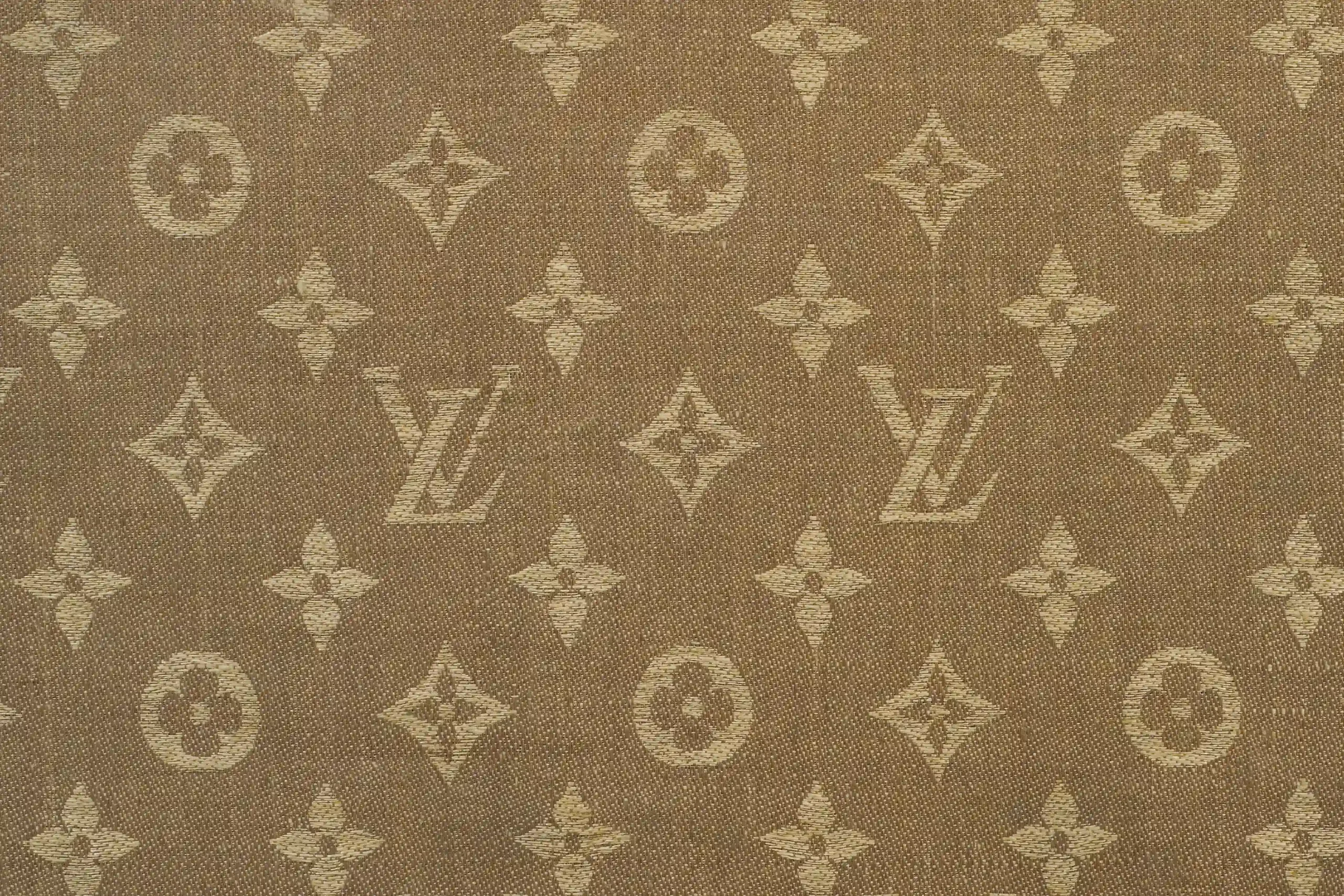
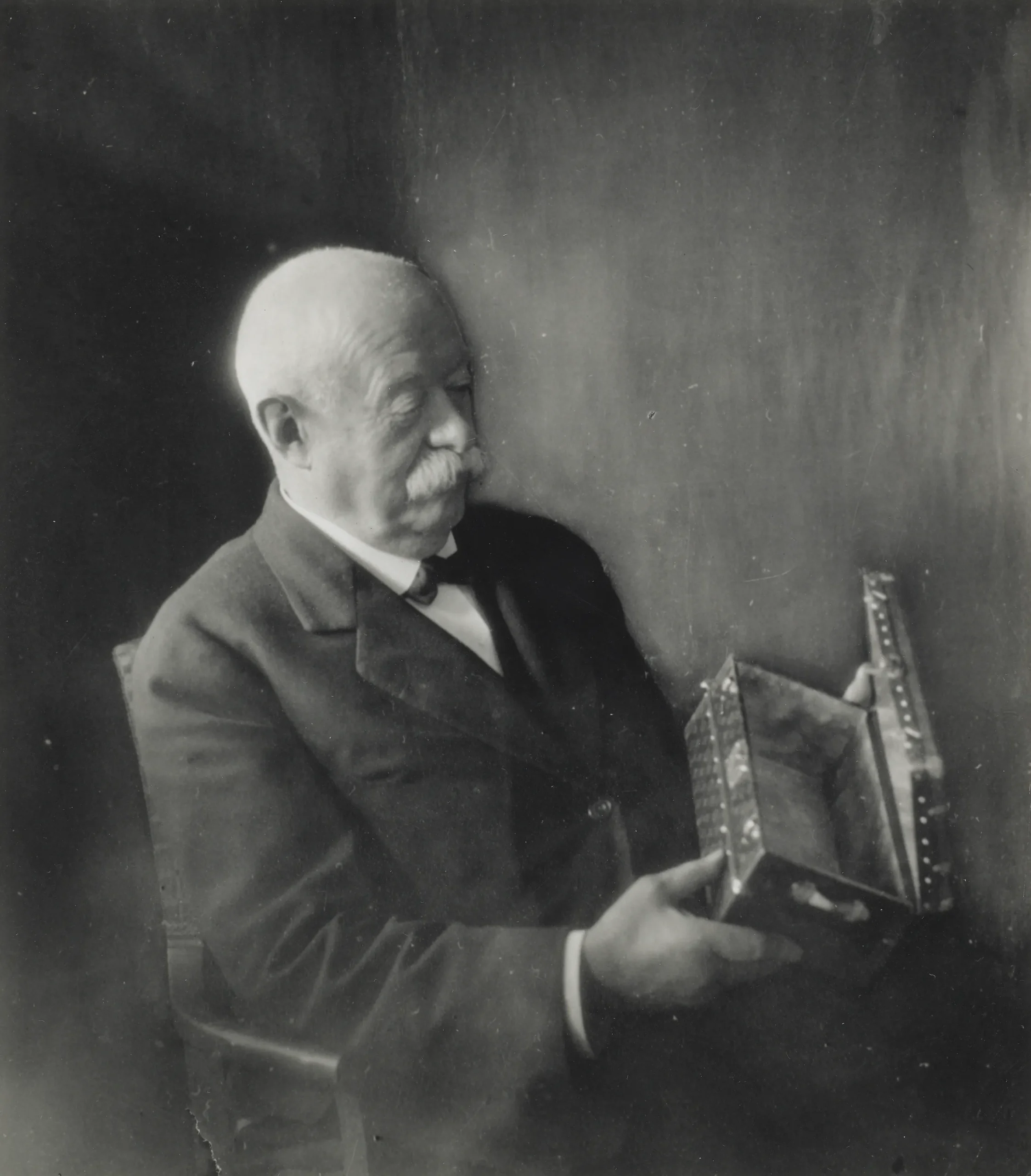
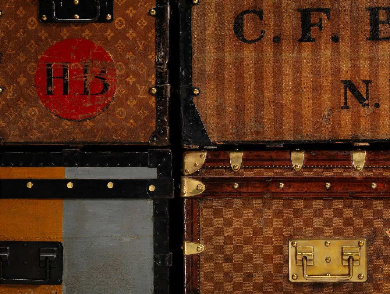
The genius of the Monogram lies in its discretion. Interlaced initials. Stylized flowers. A decorative yet deliberate look that exudes a timelessness. Inspired by Neo-Gothic ornament and the rising influence of Japonism, the pattern landed at a cultural crossroads—ornamental enough to feel emotional, structured enough to feel modern. It didn’t decorate objects; it claimed them.
A Signature That Moves
From the start, the Monogram was designed for motion. First woven into jacquard trunks, it accompanied steamships, railways, and the glamour of early travel. As journeys became lighter and faster, so did the House’s companions. The Monogram followed—onto supple canvas, into city bags, across daily life.
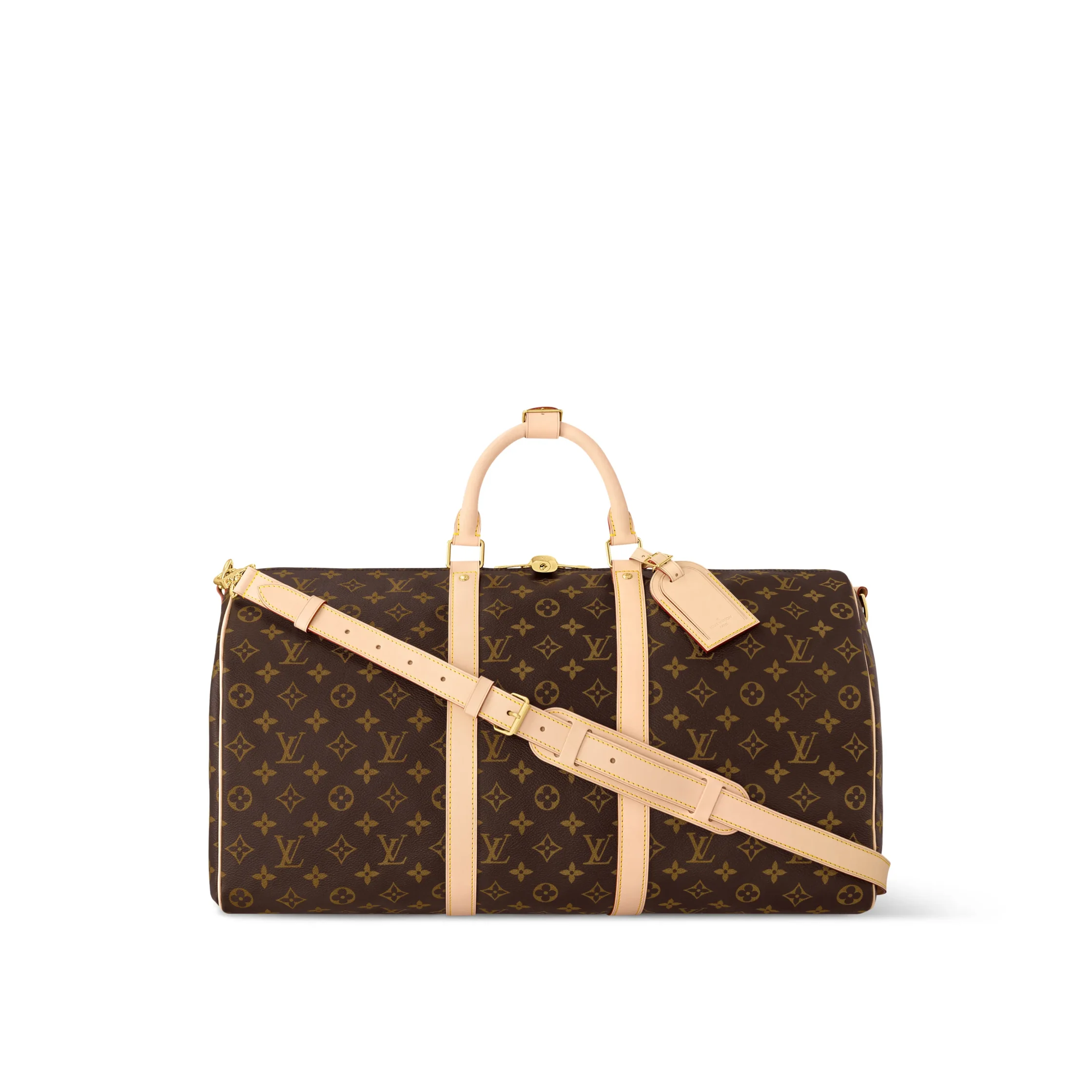
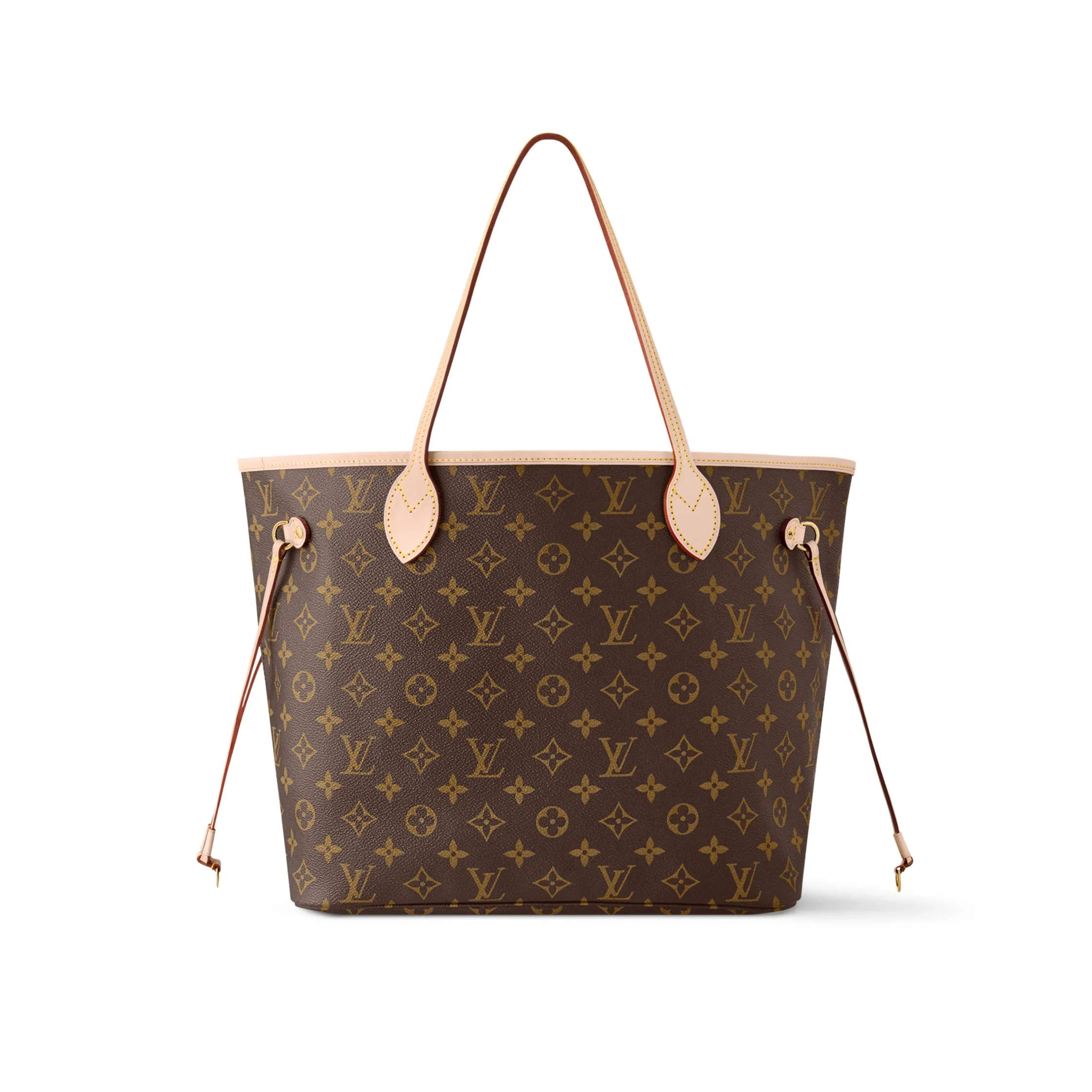
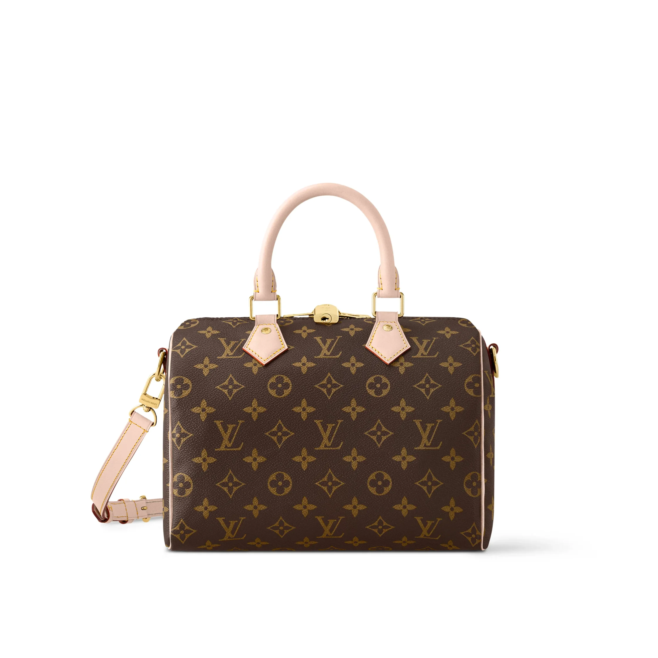
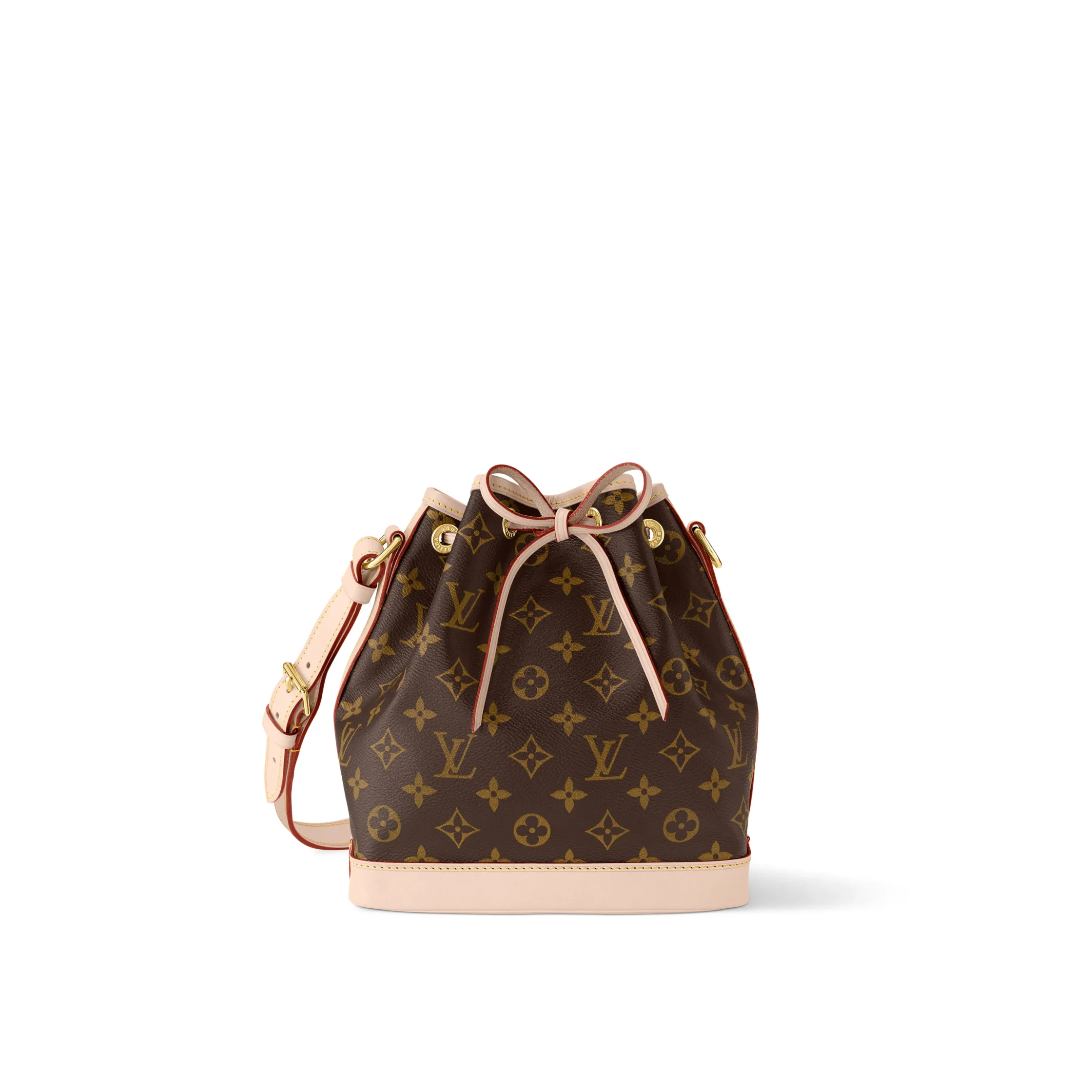
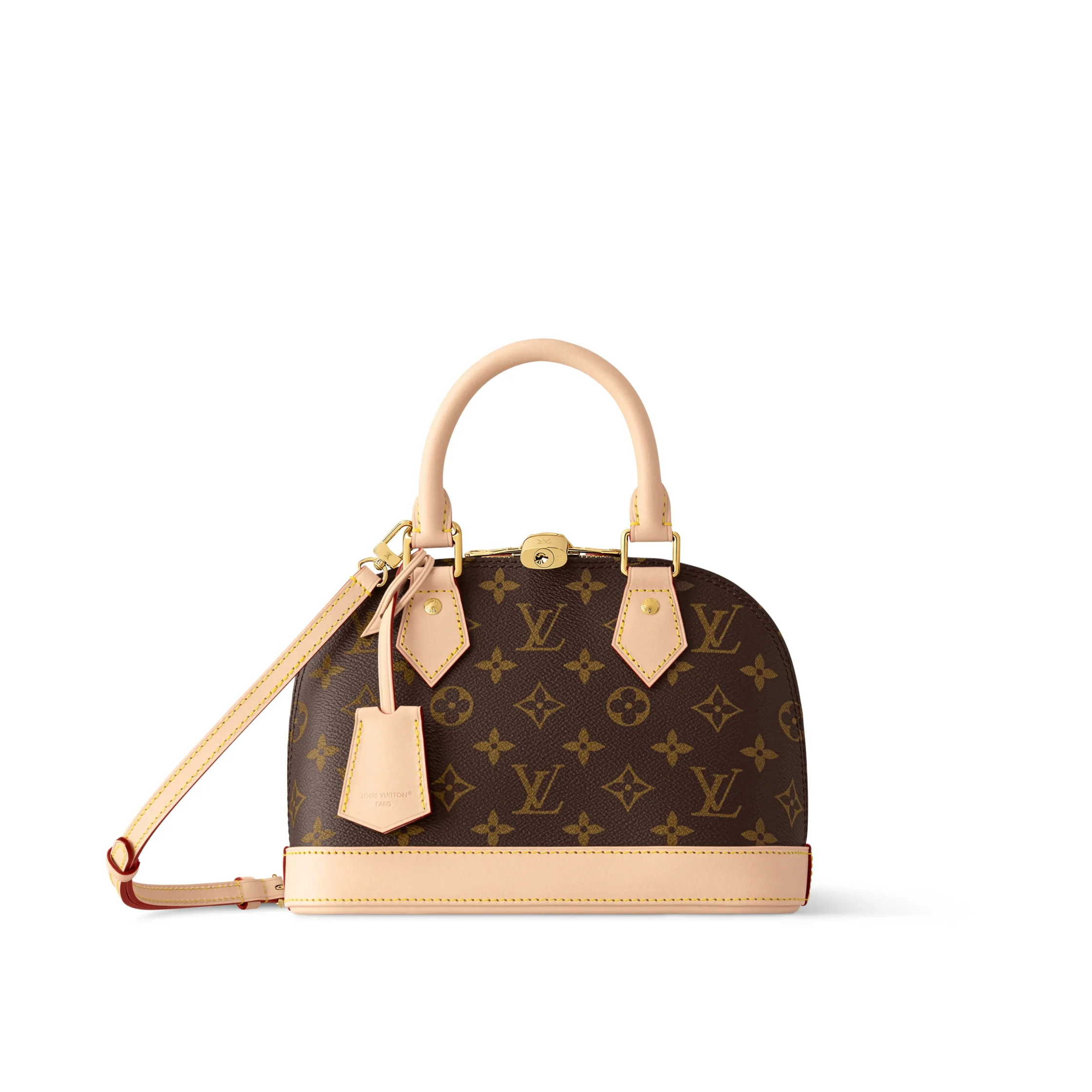
That evolution matters. Many symbols fade when they leave their original context. The Monogram did the opposite. It proved elastic. Whether wrapped around a Keepall or folded into a Speedy, it held its meaning while adjusting its posture. Travel changed. The Monogram kept pace.
The Speedy Moment
If there’s a single object that explains why the Monogram works, it’s the Speedy. Introduced in the 1930s and later dressed in Monogram canvas, the bag condensed Louis Vuitton’s travel DNA into something urban, personal, and immediate. It was luggage rethought for modern life.
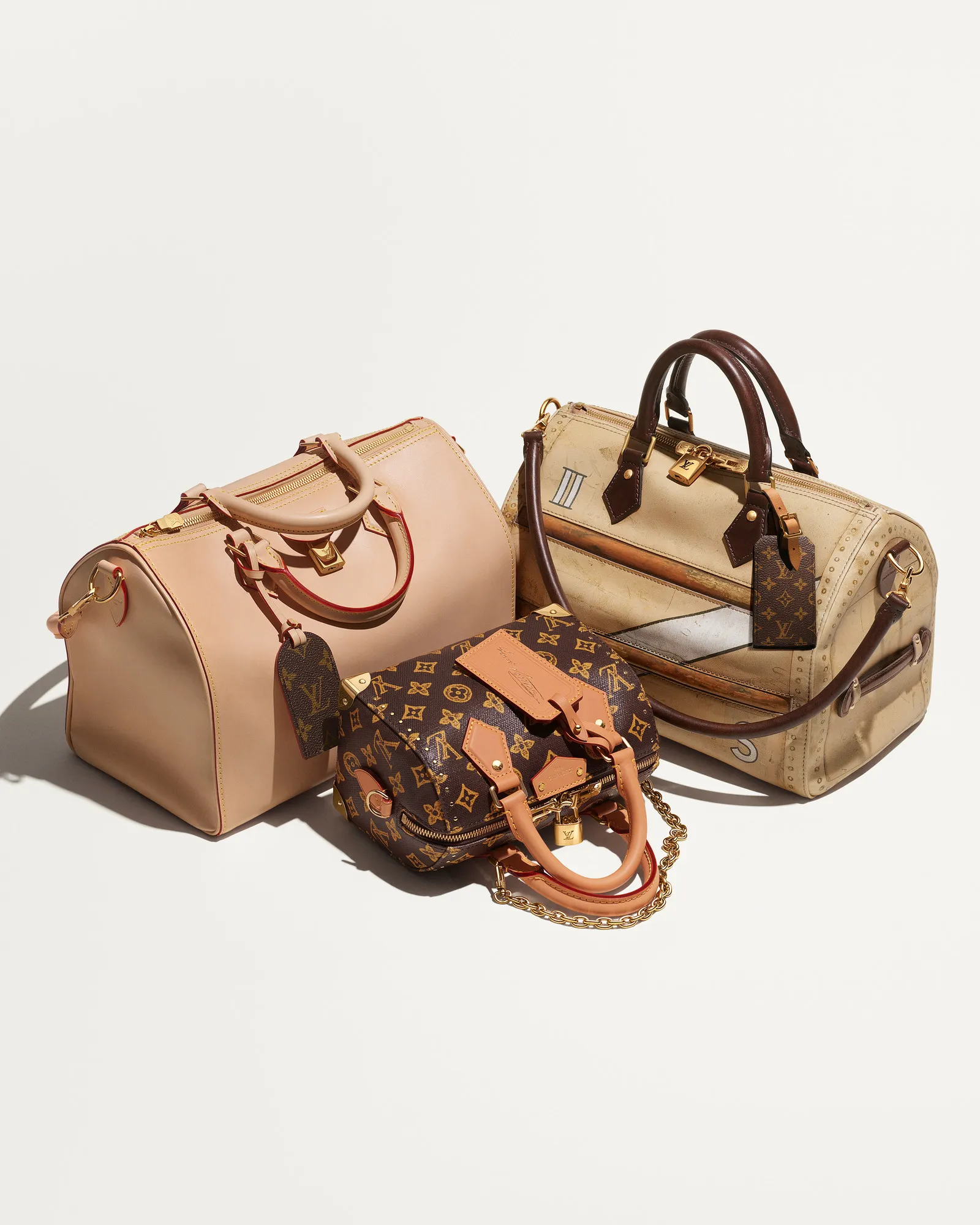
Over time, the Speedy became a cultural shorthand. Artists, designers, and collaborators returned to it again and again because its form could handle interpretation without losing its core.
Reinvention Without Erasure
A strong signature invites conversation. Over the decades, the Monogram has been treated less like a sacred relic and more like an open language. Takashi Murakami splashed it with color. Yayoi Kusama covered it in obsession. Rei Kawakubo pulled it apart. Each intervention shifted its tone, never its identity.
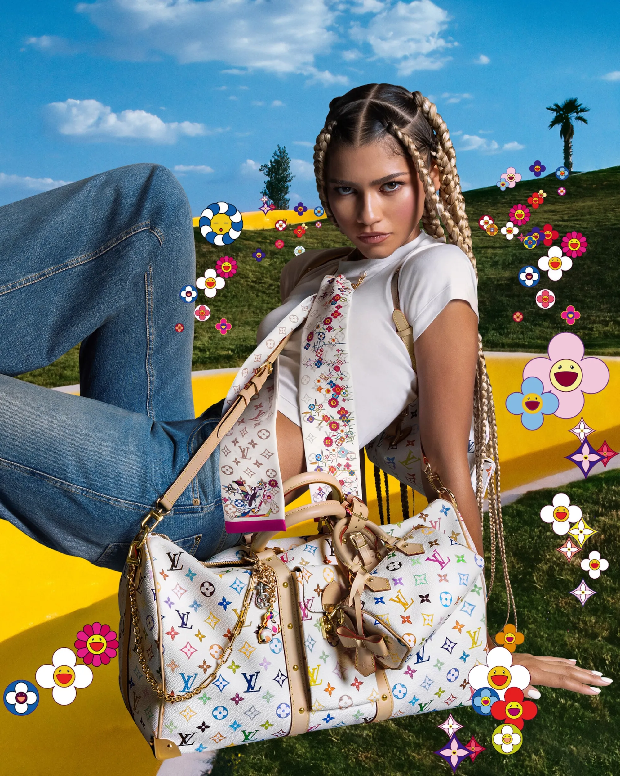
This ability to absorb new voices without dissolving is what separates enduring design from trend. The Monogram doesn’t resist change; it edits it.
Why It Still Matters
Where logos are shouted and symbols are stretched thin by speed, the Monogram’s power feels almost radical. It doesn’t chase attention. It assumes recognition. You spot it across a room. You understand what it carries before you know who’s holding it.

That’s the luxuryLuxuryrefers to a state of exceptional comfort, elegance, and quality, often characterized by premium craftsmanship, exclusivity, and superior experiences.Go to Luxury Glossary of longevity. Not noise, but presence. Some symbols age; others stay instantly recognizable.
Photos courtesy of LOUIS VUITTON
Recommended Video
Latest Posts



Latest Issue