Recommended Video
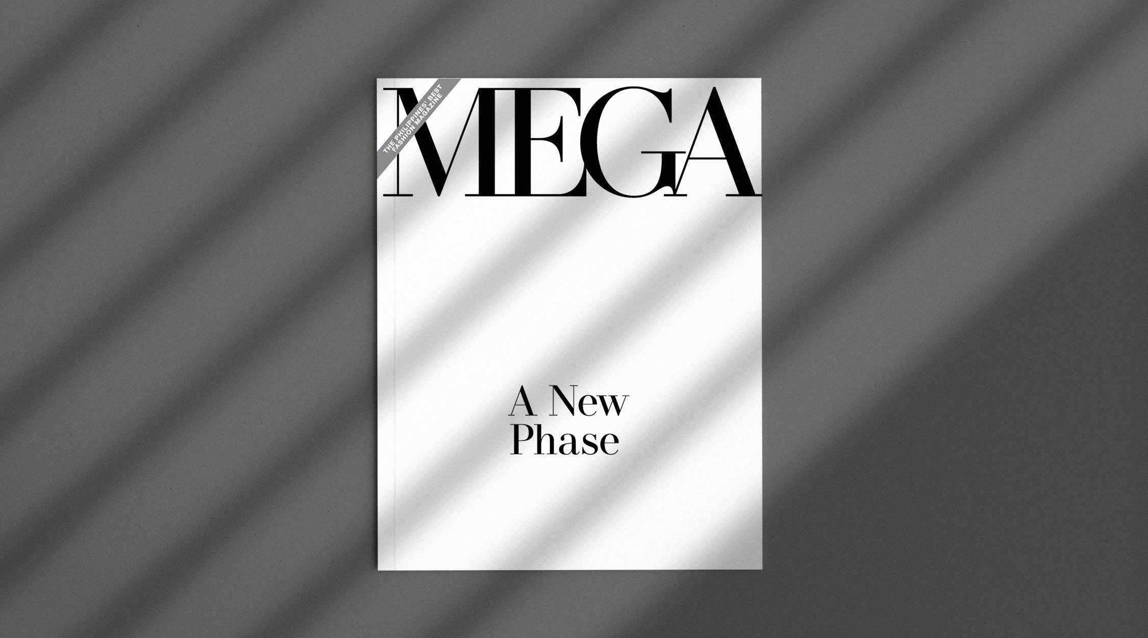
For more than 20 years, MEGA has established its name with its soft-edged serif typeface that we all know and recognize. Today, MEGA has evolved into a sleeker and edgier look—one that has fully matured into its recalibrated core. RELATED: #MEGAHasChanged: This Is The New Phase Of A Bolder And Braver MEGA Cliché as it may sound, re-evaluating a brand’s core, let alone changing its visual identity, does create an inevitable ripple effect. Having a new face for MEGA comes with a lot of changes in terms of visual direction, editorial storytelling, and journalism. With our late founder Sari V. Yap’s clear direction of establishing a homegrown media brand of international standards, it has also become very fitting for MEGA to adapt and evolve with the times. In MEGA’s 28 years of existence, there have been five notable logo evolutions including the latest one. Upon its inception in February 1992, MEGA’s […]
This content is available to our subscribers. Subscribe now to access premium stories and e-magazine library.